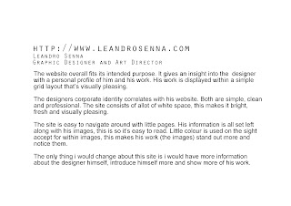
I started my web design project by researching into what makes a good website.
I analyzed websites to see what conventions made them attractive.
Here's my analysis of a simple website. Although i found some bad points, i did like the
whole layout and feel of the site, it was simple, but for me a little too simple.
The site lacked personality.
I then analyzed a site that was in a way the opposite of the other one.
It had a lot more personality and was nice, a little busy, but the feel of the
site was sophisticated.
Once i had an idea of what conventions of websites i liked, i created some 'looks'
in photoshop that i wanted my site to look like, or there-abouts.
I want a simple layout with minimal colour, i don't want
to deter the viewer from my work by having too much going on.
I want my work to all be in colour images but maybe have the rest in
black and white, with black and white graphics and then when clicked some colour.
I want my site and work to be centered because i found when researching
it makes the site nicer and easier to look at.
I decided to create my site in Muse, although i had training in Dreamweaver.
I chose Muse because it was better at creating simple sites.
.
Here are screen shots from my final website design
A full navigation through my site
.
I decided not to make my site live just yet because im still evolving as
a designer, although i am more than happy with the site and would
love to publish it.


No comments:
Post a Comment