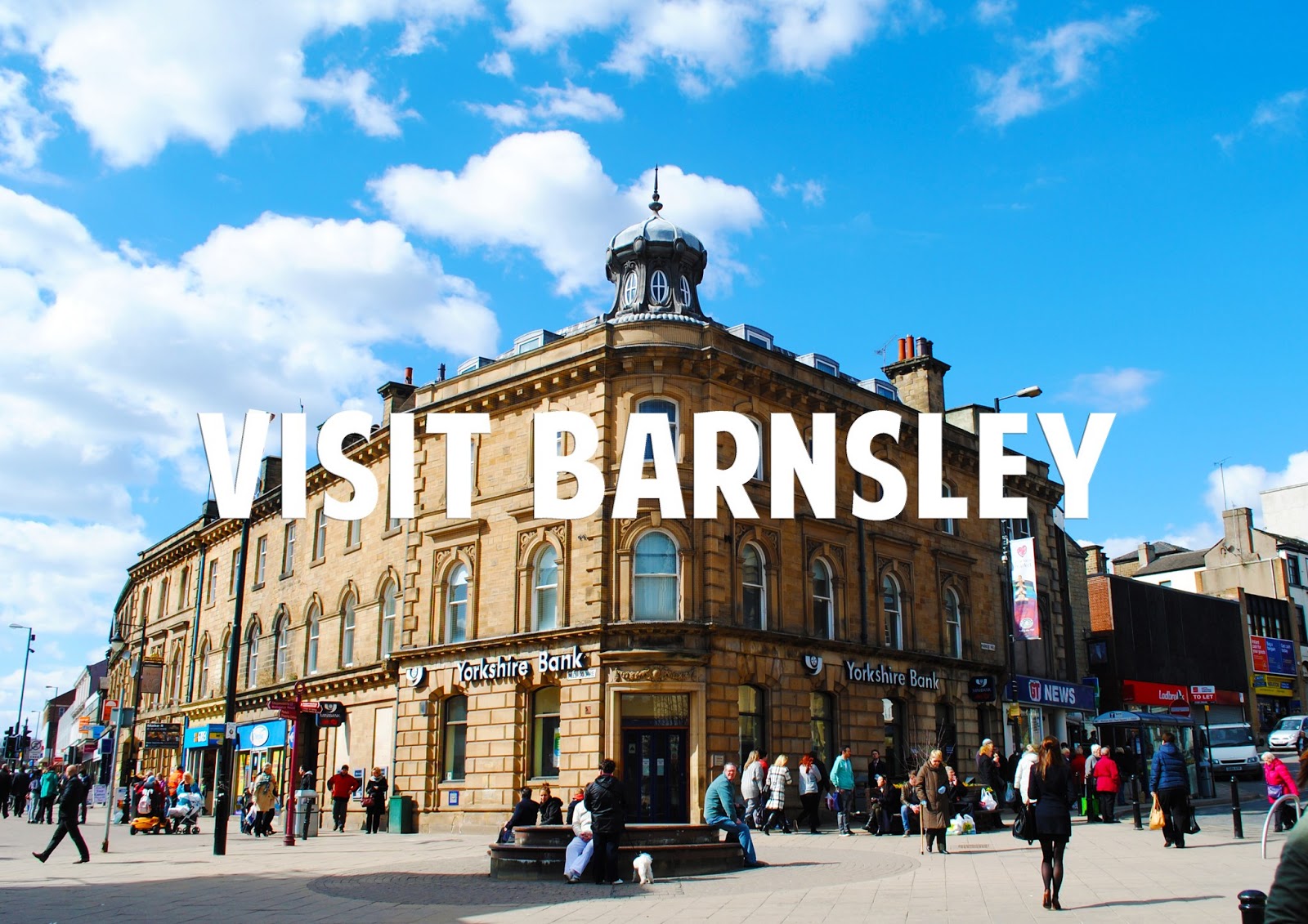
My experience of Barnsley, images taken by me whilst there for the day.
When visiting Barnsley, I was taken with its architecture design.
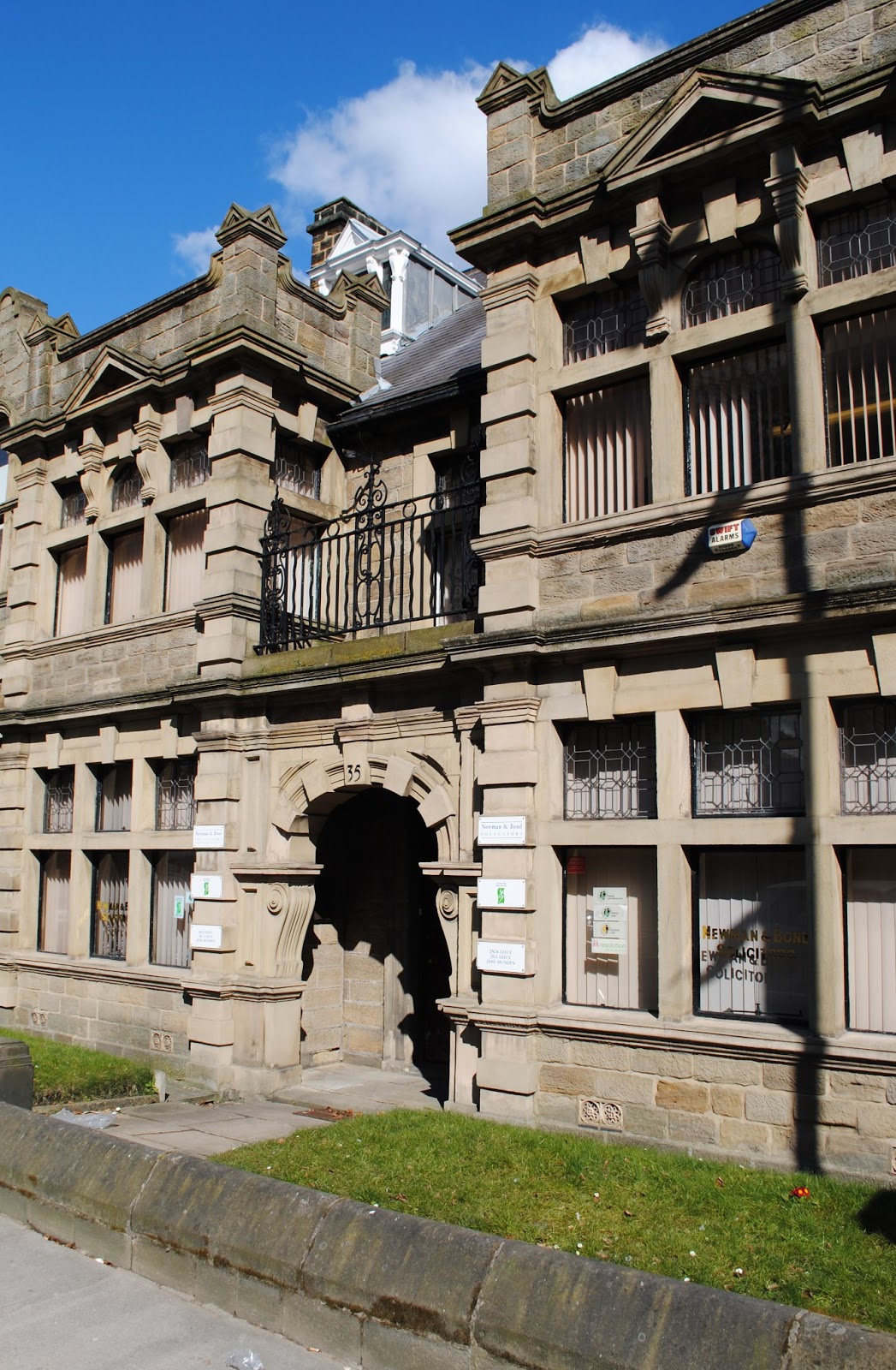
I loved the contrast between the old and new designs for example the town hall and the bus station.
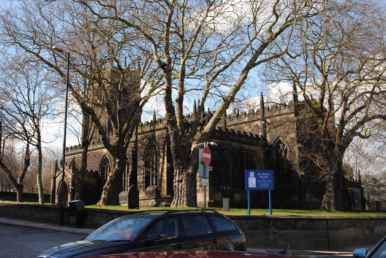
More examples of Barnsley's old architecture.
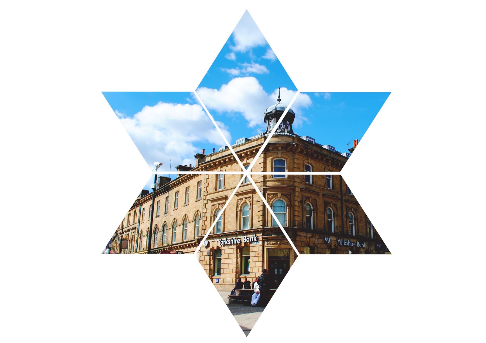
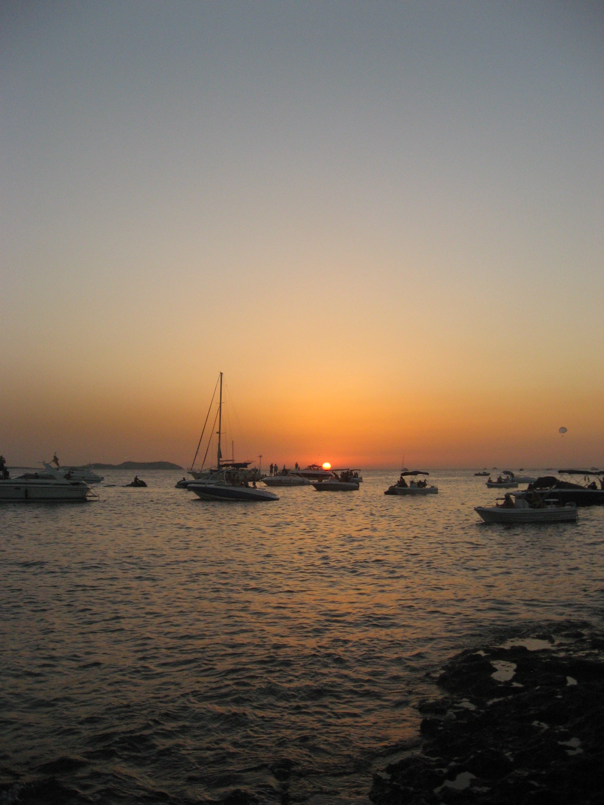
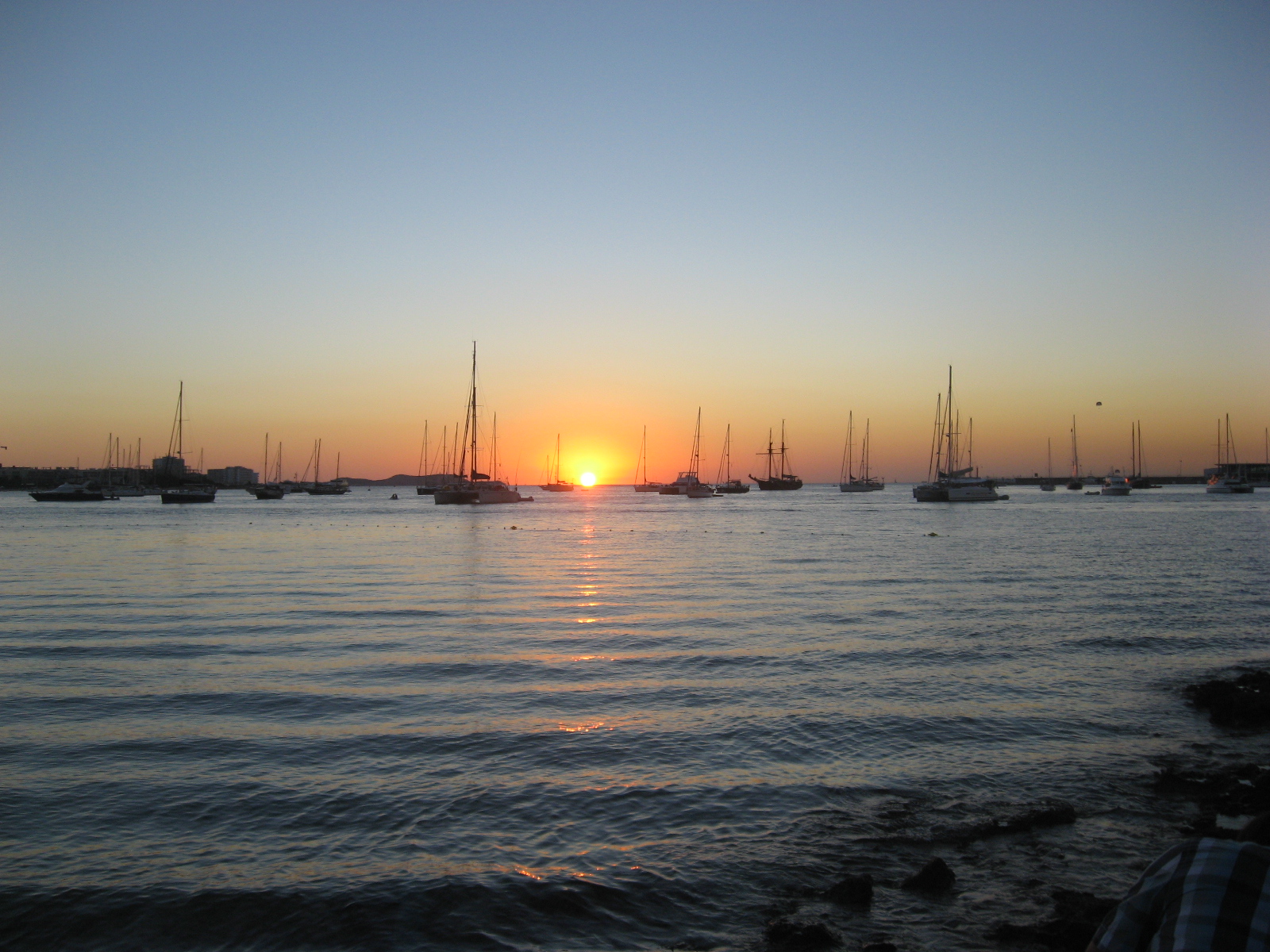
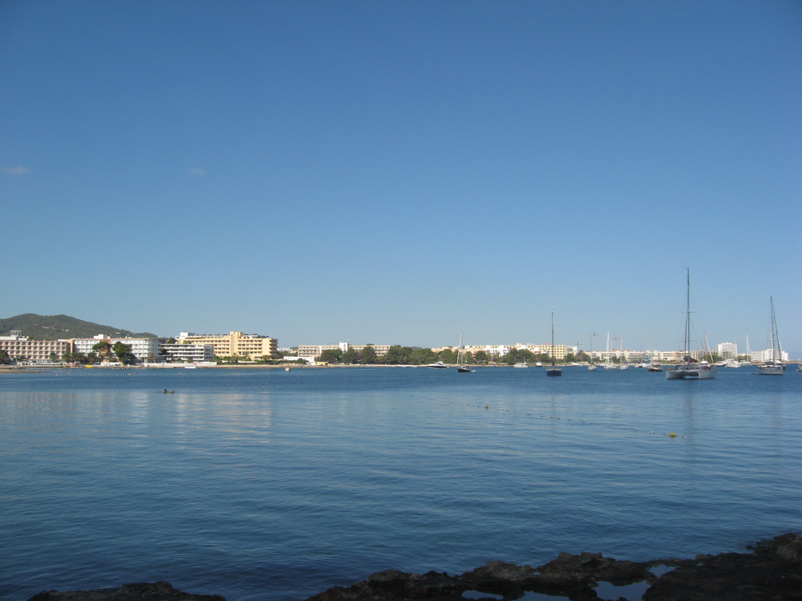
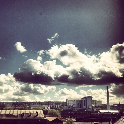
Views down the high street, a stark contrast to the old design in the pervious images.
The cooper gallery, part of the Visit Barnsley campaign.
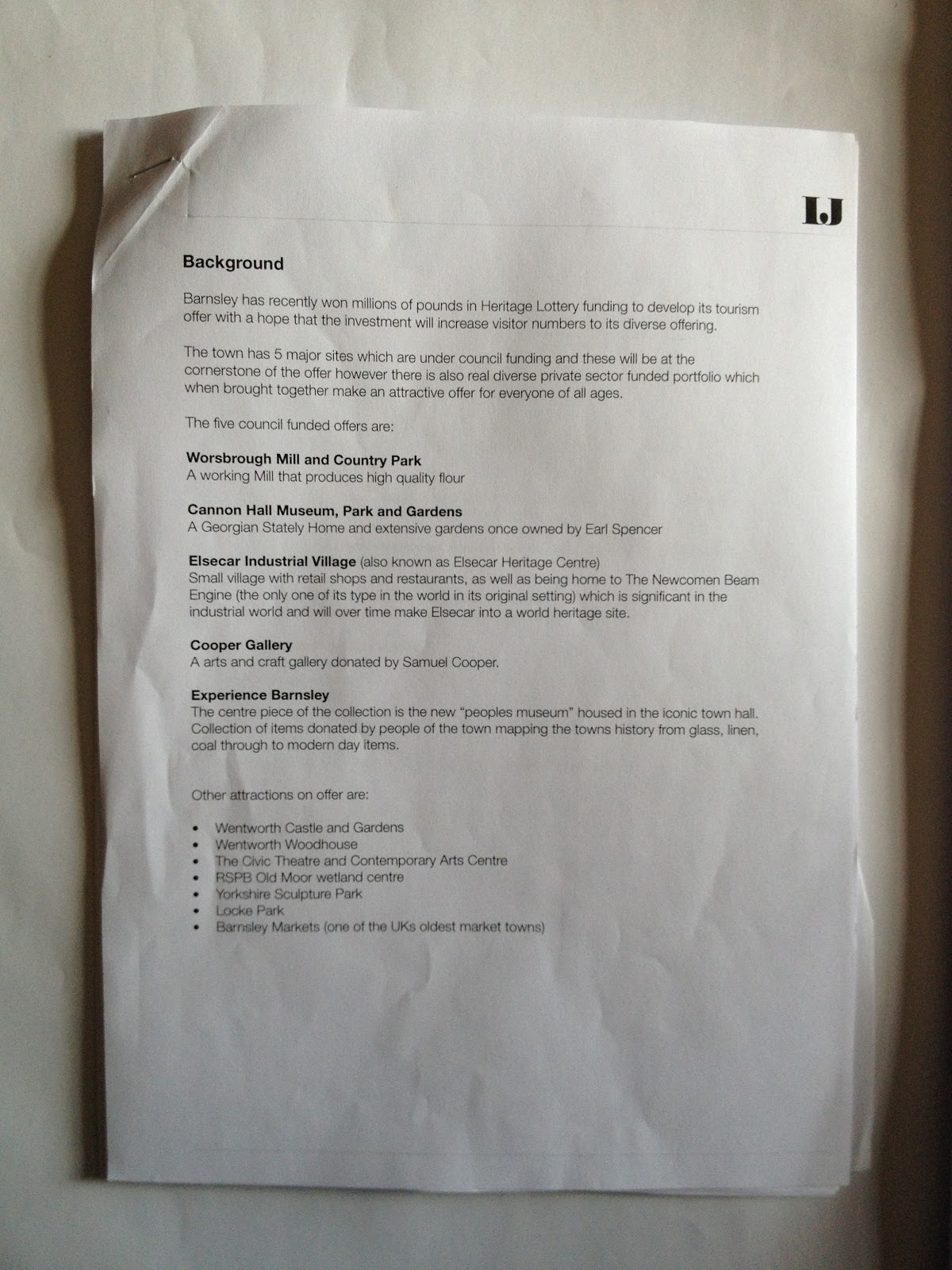
Research
I was surprised at the amount of charity shops in Barnsley, perfect for vintage shopping!
I bared this in mind when looking to create a campaign, I thought about including It in poster campaign images, in a humorous way.
I did notice the people in Barnsley had a sense of humour about them.
I wanted to try and capture the accent and the friendliness of the town.
I could do so by involving funny characters within the campaigns or the accent on the posters.
Barnsley is proud of its football. I could maybe involve this in my campaign.
not sure if it will fit in with the overall sophisticated look however that I want to achieve.
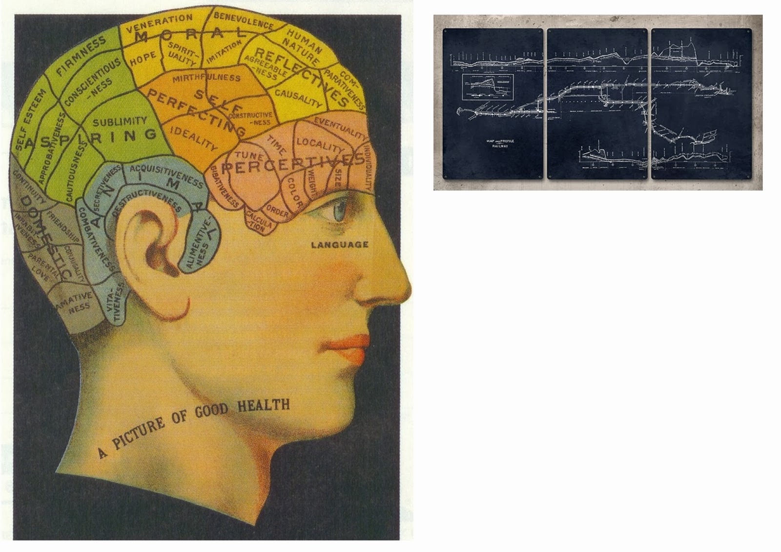
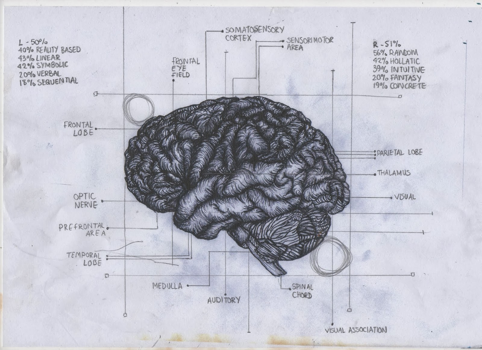
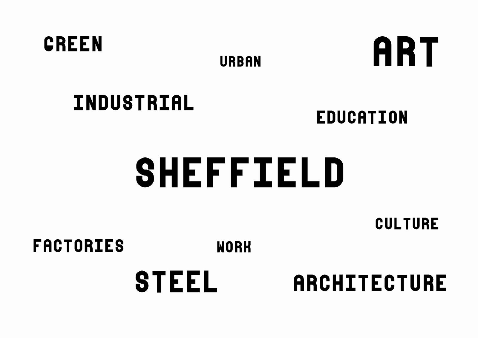
I began the whole project with the brief and looking at key words it uses.
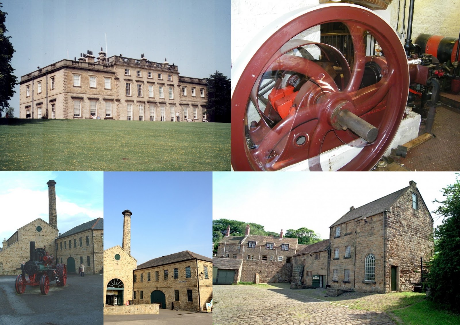
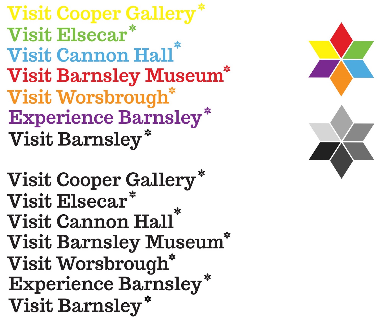
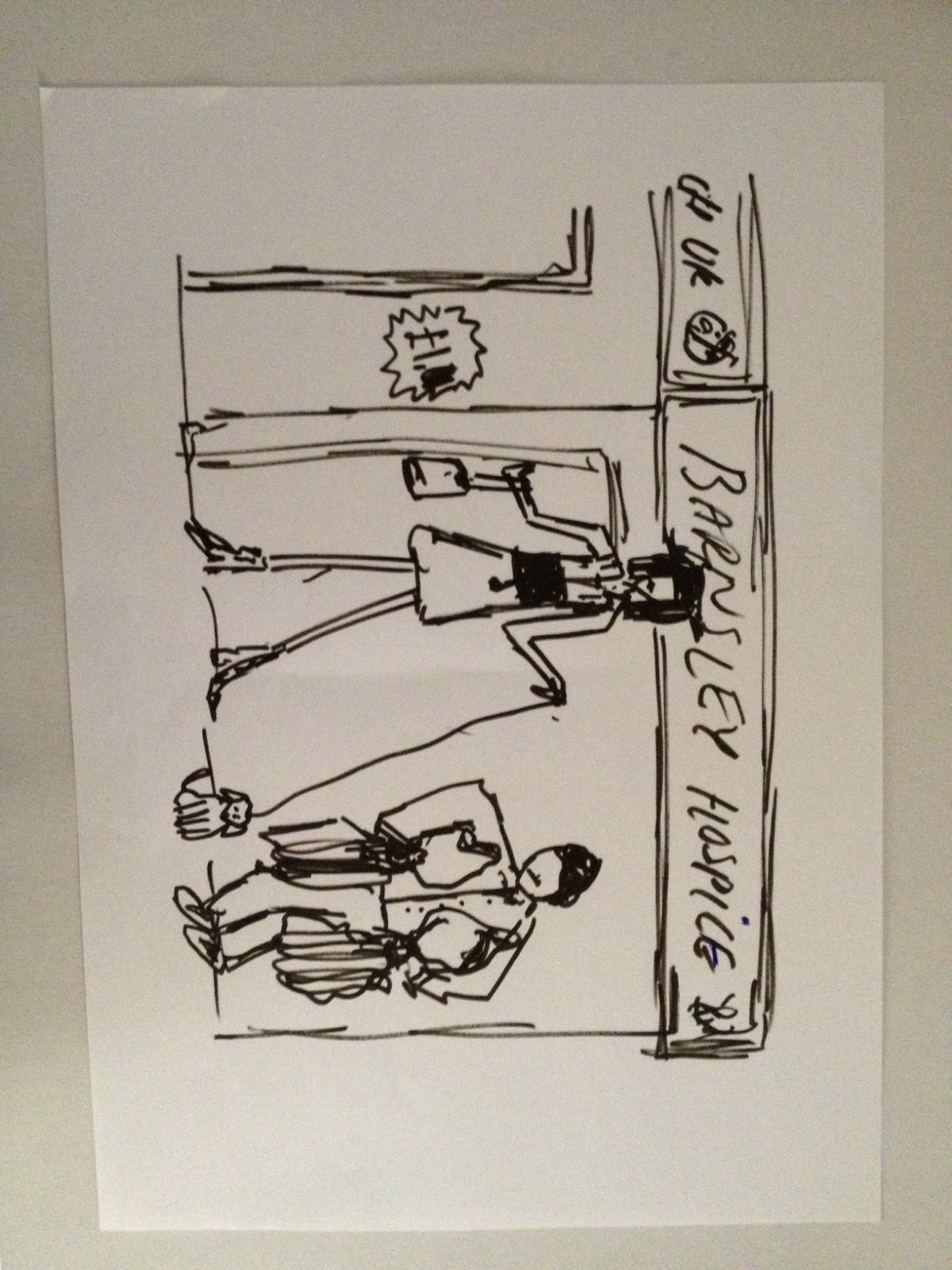
images of the other Barnsley attraction sites
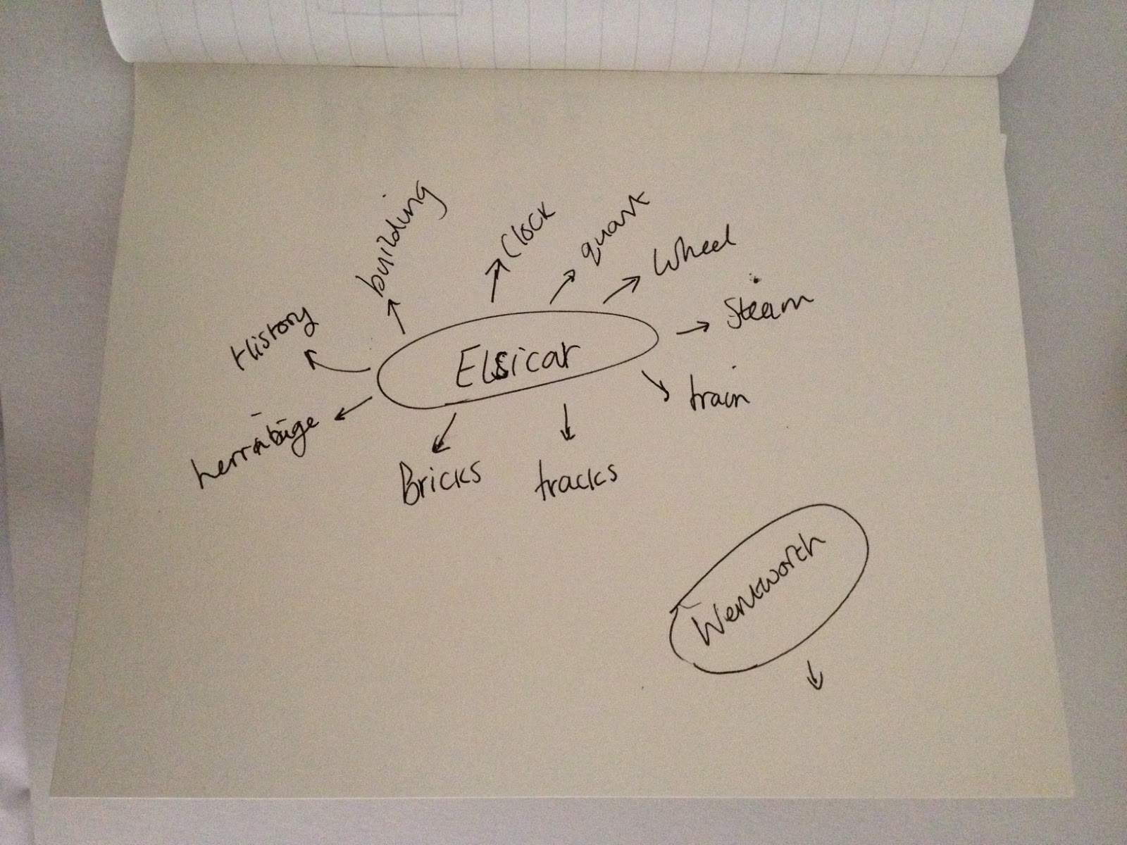
including Cannon Hall, Worsborough mill and Elsicar heritage.
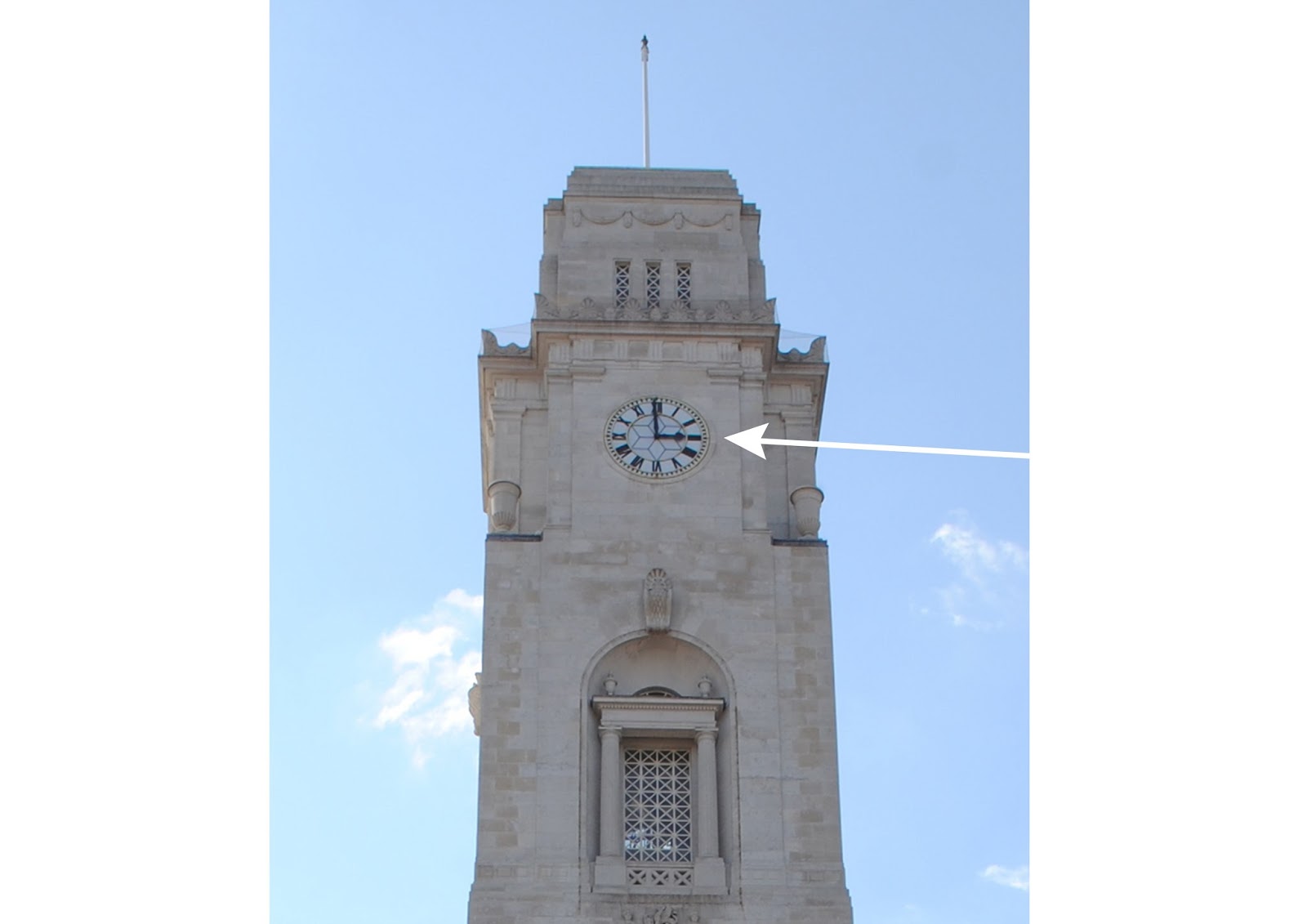
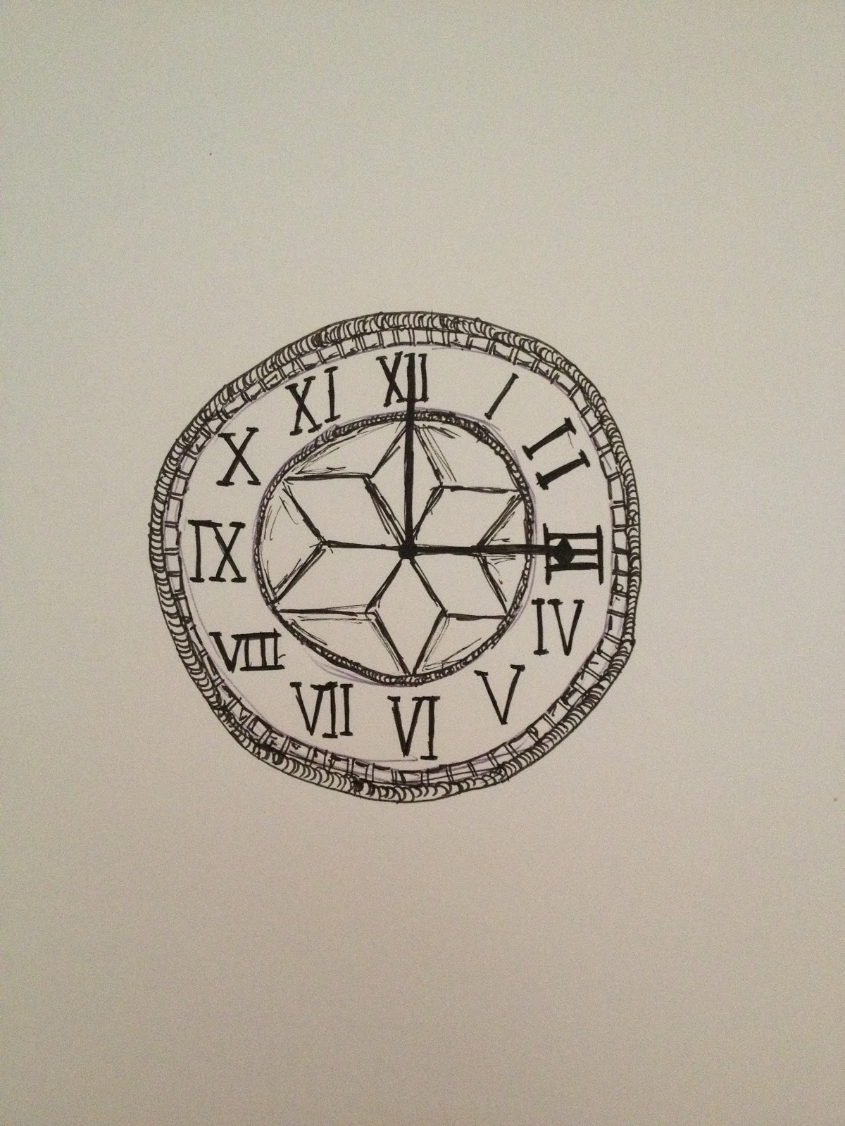
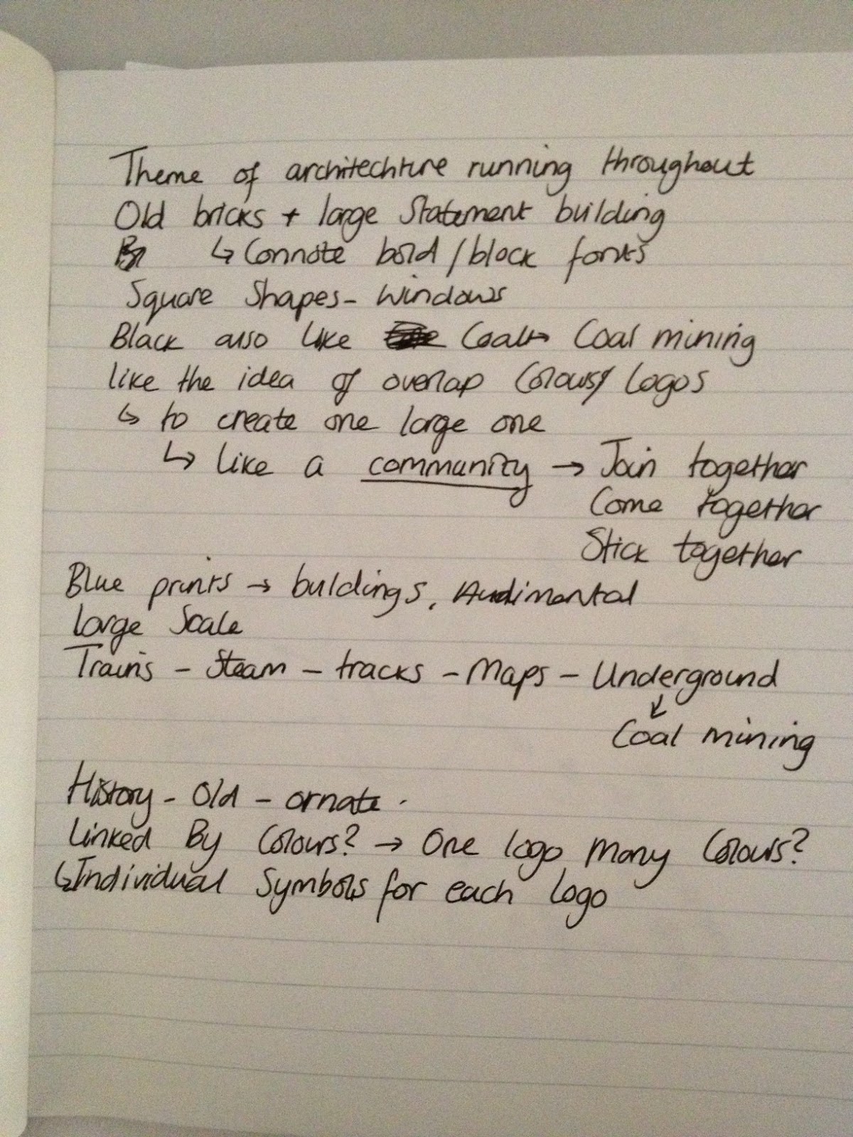
When rounding up my images and research of the town centre, i was taken with the town hall and found myself coming back to its structure and design. Then when researching the town hall further I noticed the clock, I then looked into the shape of the clock and if I could include it within a logo. The town hall clock is a central landmark so using it as the Barnsley logo is like bringing together all the sites in one shape.
 The shape on the town hall clock Is a simplified flower, note in the image above with the arrow pointing out the clock face. I took this shape and using illustrator made my own version.
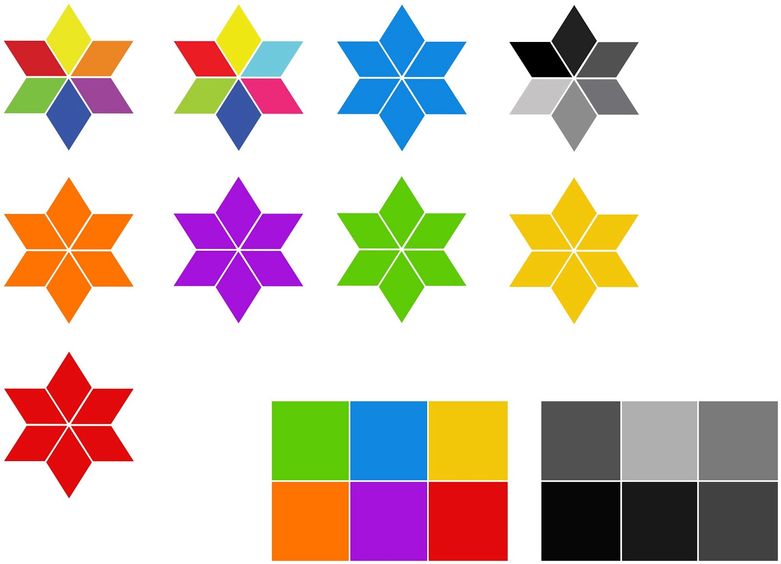
Studying the shape further it connotes a flower, like the flower of the north, it also resembles a cirlcle which could connote the wheel, as seen below at Elsicar heritage. It also resembles nature, the nature of Barnsley and the countryside of Cannon Hall.

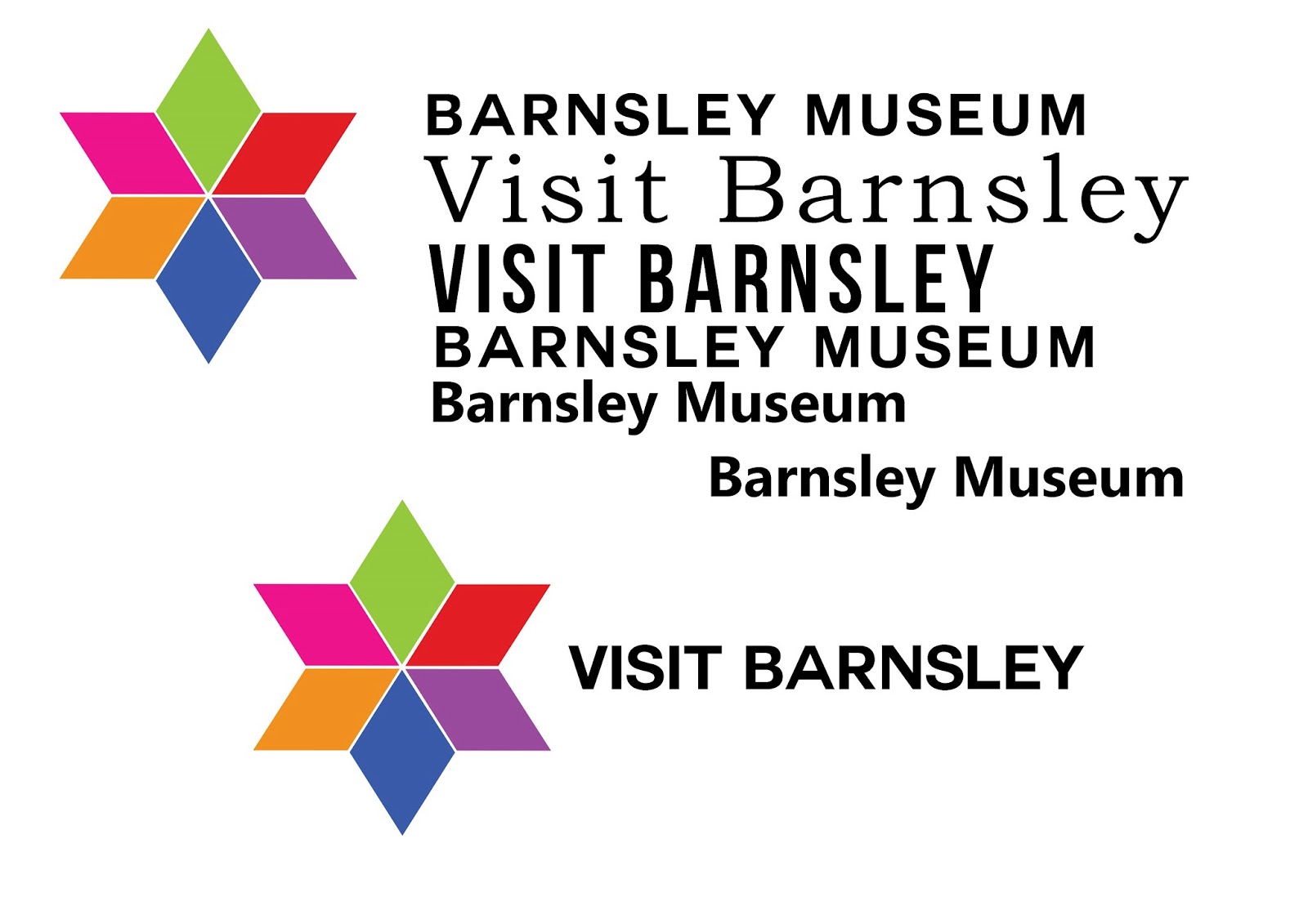
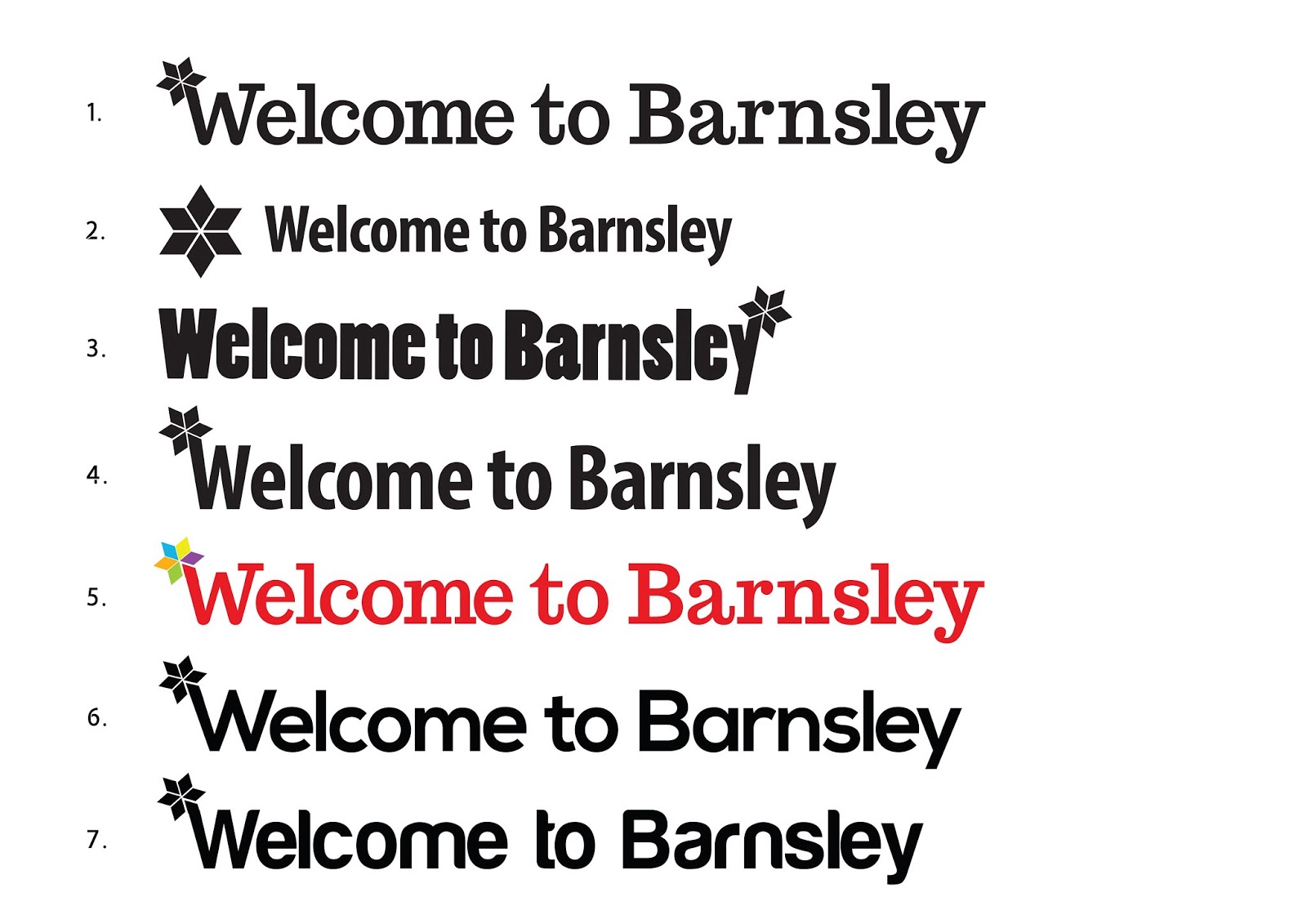
I created colour variations of the logo as well as a black vector which I can copy and paste into other designs. I tried to develop the logo further and put it in position with type.
I experimented with the shape and image, maybe an idea I can develop further later on when creating the campaign posters. The more I vary this shape the more I think its appropriate for the brief, it works perfectly with type and image.
Experimenting with typefaces and colour varieties
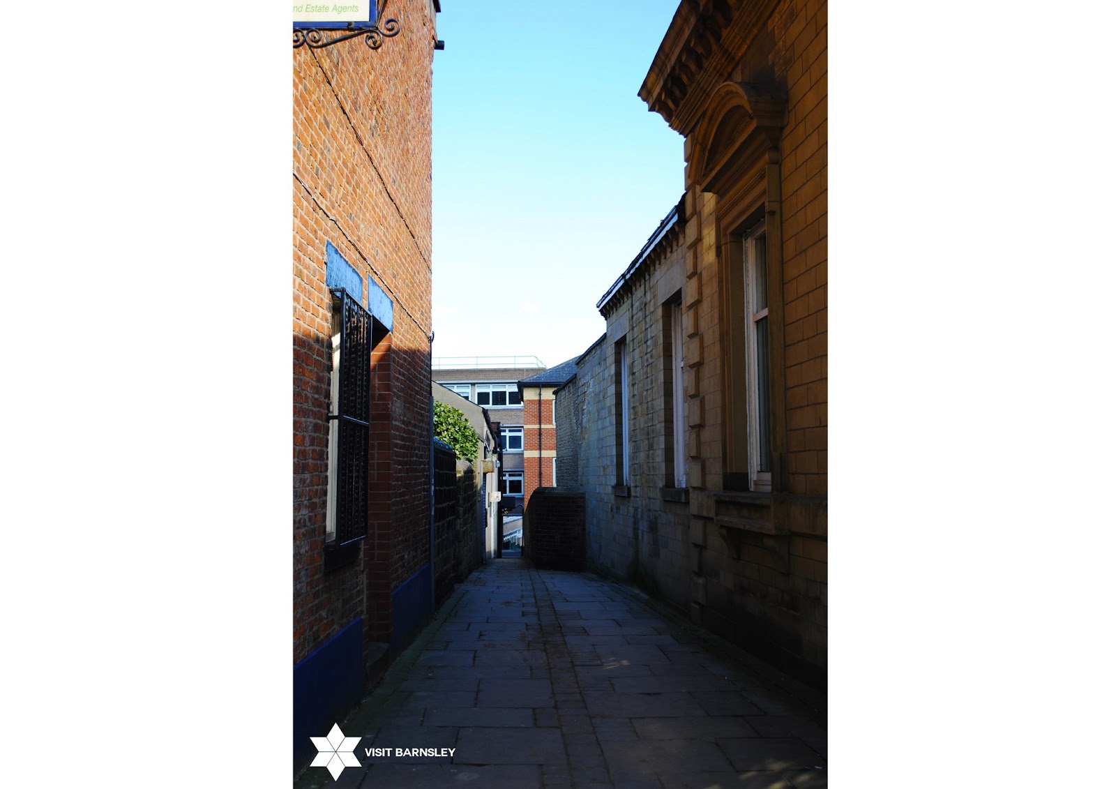
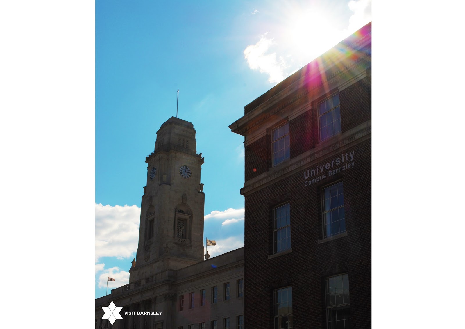
Putting the logo on top of images I took in Barnsley, to get a feel of its shape and how well it might sit within a campaign.
I put a variety of images behind the logo shape
this allowed me to show Barnsley and its different sites
I then started to come up with 'slogos' that I could use for a campaign
phrases that would draw people in and invite them to Barnsley.
Alternative Logo Idea / further development
Rough campaign idea
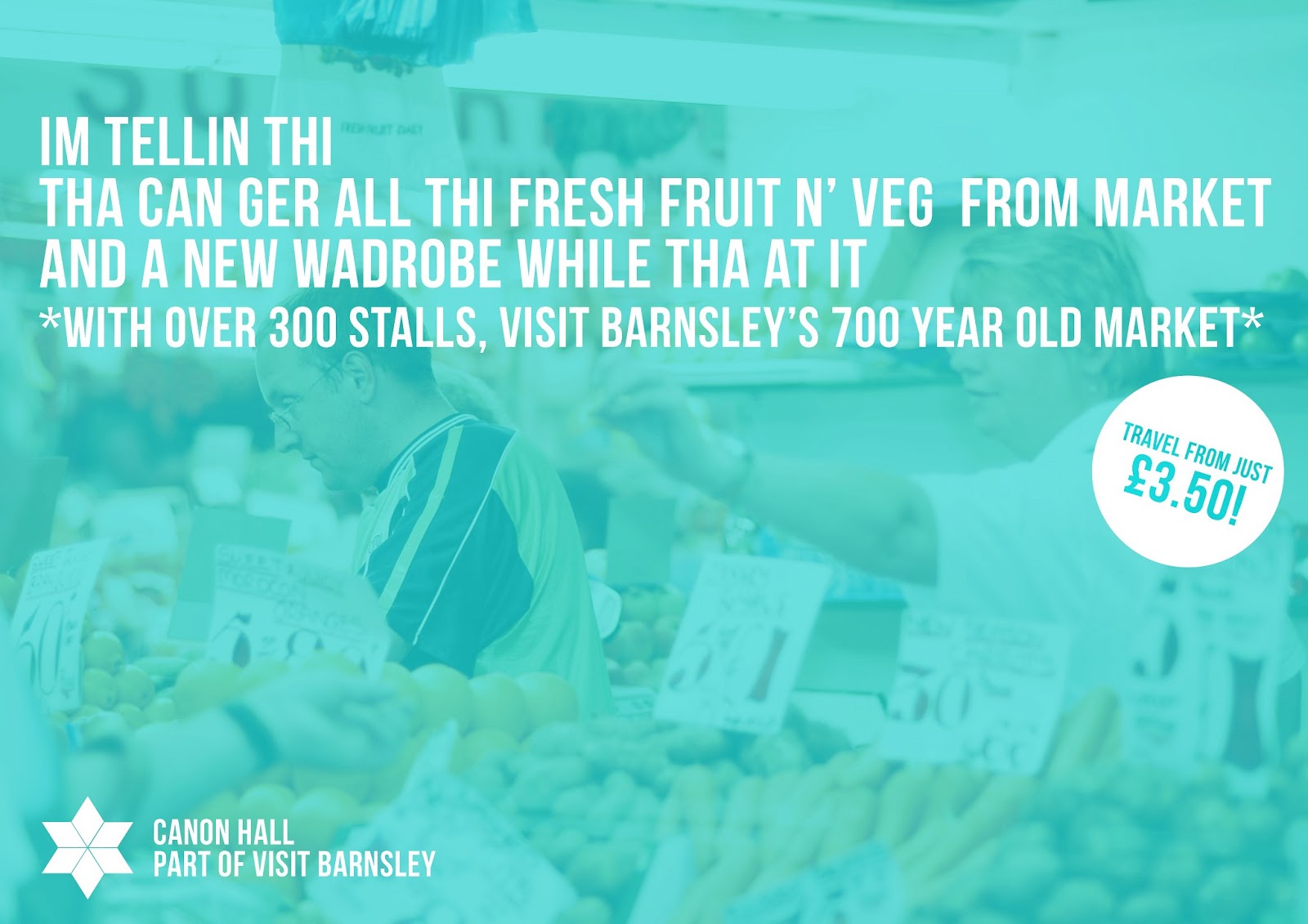
I looked into the humour of Barnsley and how I could maybe include it within my campaign.
without crossing the line I chose to use Barnsley phrases on posters, that way it brings in the humour and light heartedness I want to portray.
Roughly putting the phrases and logo into context
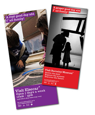
I created here some train station posters that show imagery of attraction sites.
However at this stage I'm not sure about the logo.
Final Outcomes
Logo Design
I created all my logos in Adobe illustrator
Poster campaign
Posters were created in photoshop
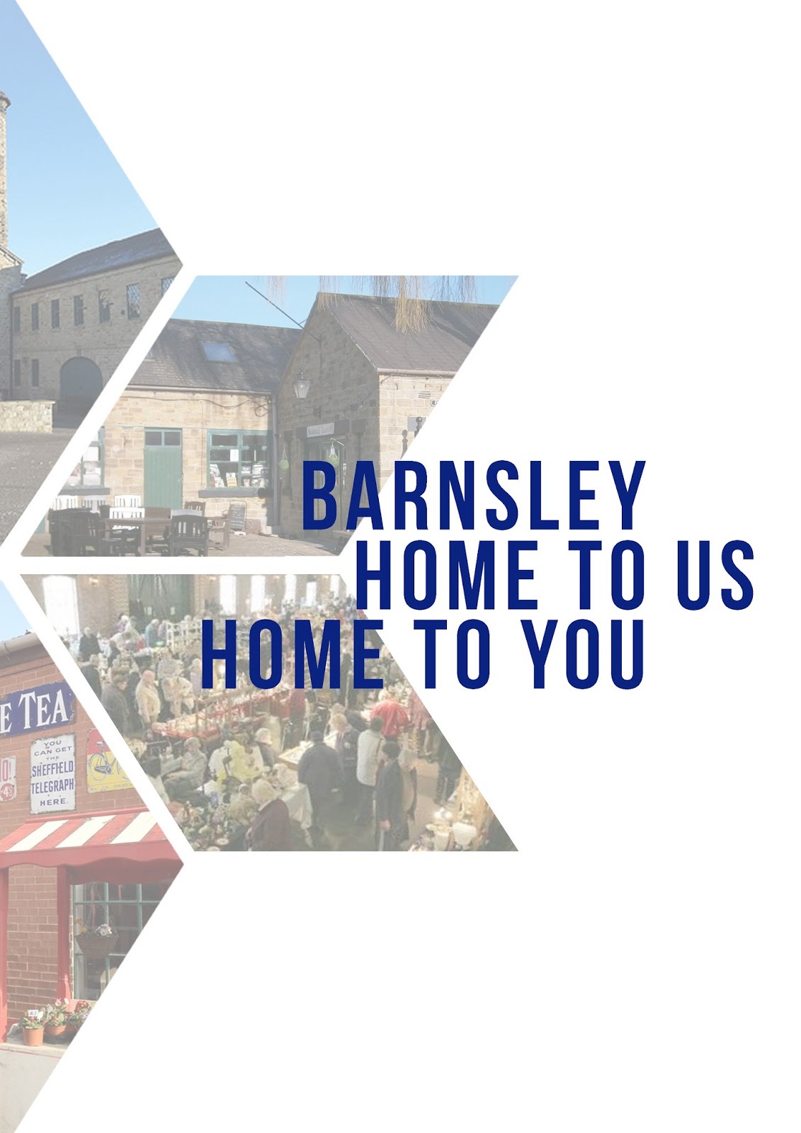
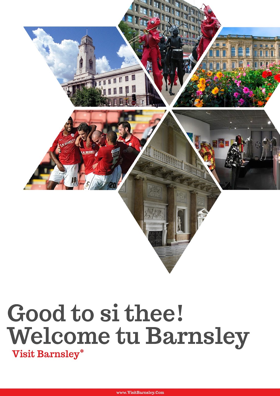
I used the logo with the imagery behind it, this way I could show the attraction Barnsley has to offer. I wanted to keep a clean overall theme that delivered a friendly message.
Poster concepts in context
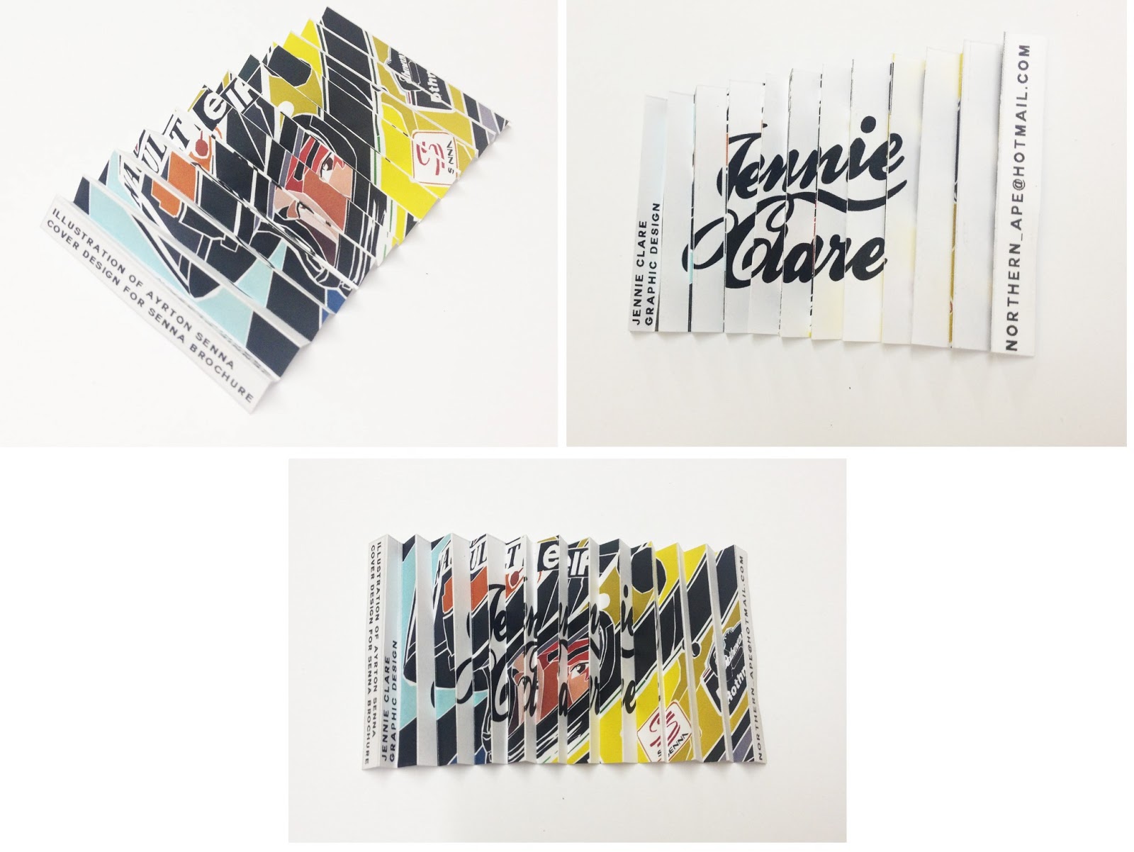
Flyer Designs
An example of what the logo might look like within a Brochure
.
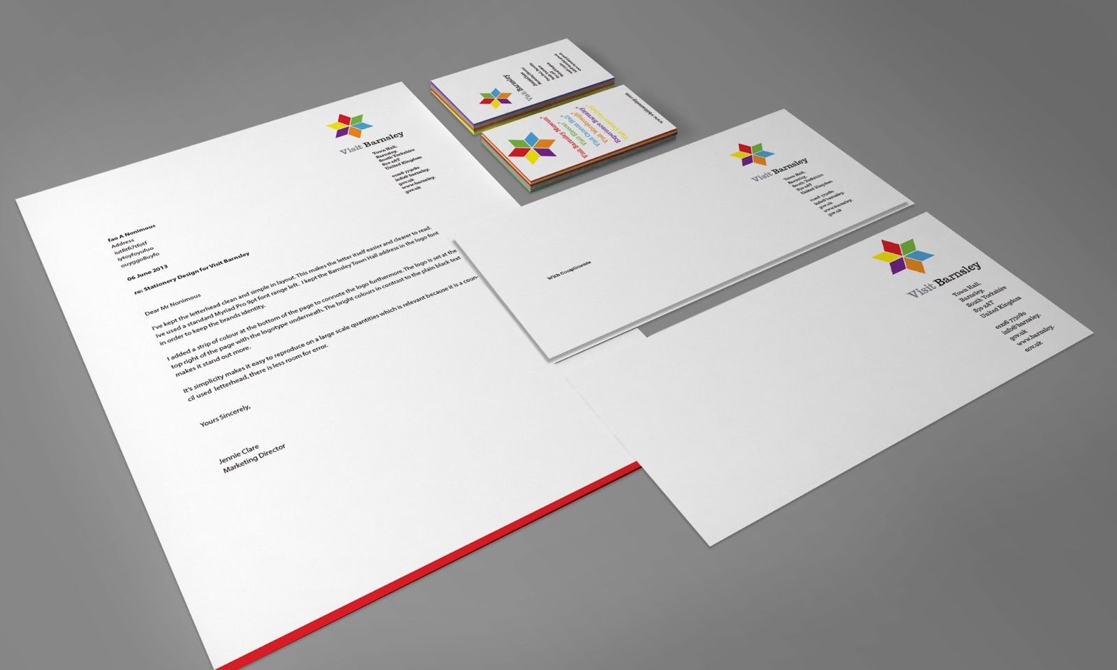
A view at what the logo would look like on stationary
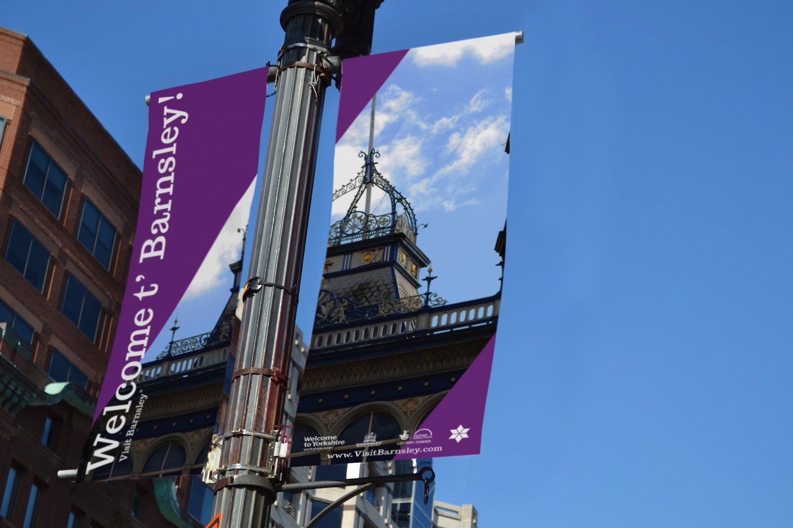
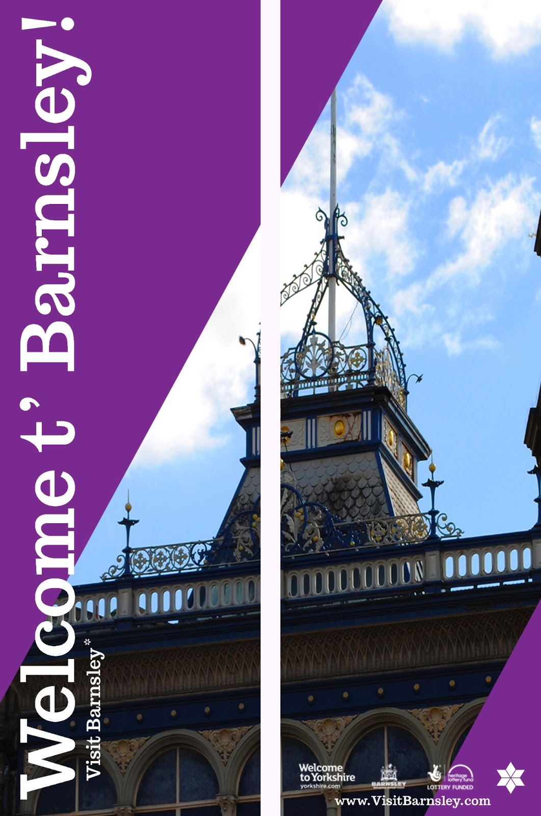
Banner Designs for the town centre

Development Work and Research
Over I really enjoyed this project and wouldn't change my outcomes, if anything I would develop my ideas further and create a much larger campaign, for example impose my logo onto buildings and create outdoor sculptures with it such as fountains and flower beds. I think my designs fit the brief and show a positive portrayal of Barnsley and met the companies requirements. I has trouble creating my stationary and how to lay the logotype out but eventually overcome this idea and decided to keep it simple and clean. I believe my work is to a high standard as I could achieve and am pleased with the overall way it looks.


.jpeg)


 I began the whole project with the brief and looking at key words it uses.
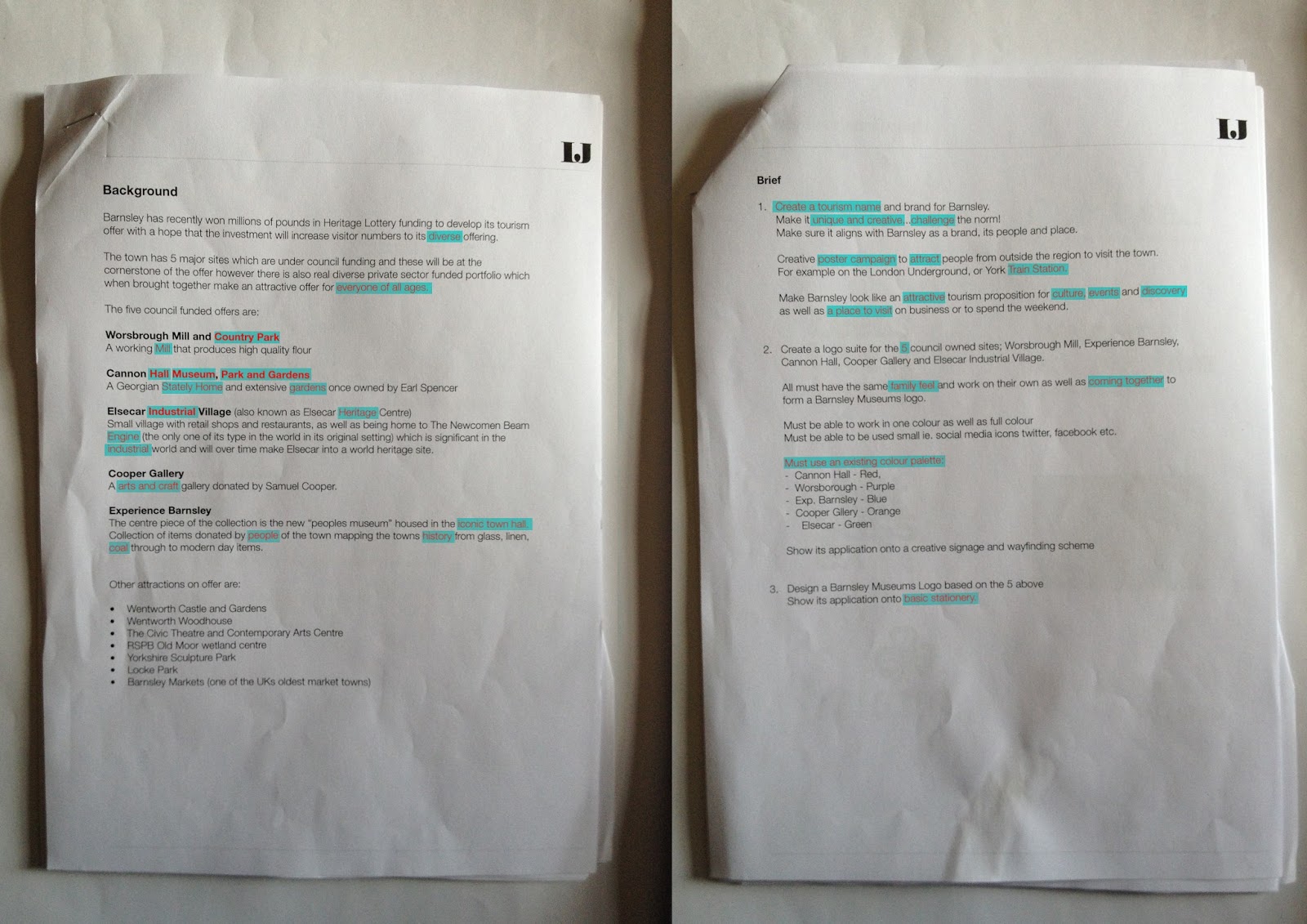


