
This project was to create a 'cool' brand of wine.
Here's my development process including all rough sketches and plans.
Hope you enjoy, had a lot of fun on this project.
What is 'Cool brands' ?
http://www.coolbrands.uk.com/
The aim of the project was to create a wine that is considered cool, and essentially be a contender for Cool Brands, personally i think i achieved this.
What is 'Cool brands' ?
http://www.coolbrands.uk.com/
Since 2001, we have been canvassing the opinions of experts and consumers to produce a barometer of Britain’s coolest brands, people and places. Each brand featured has qualified for inclusion based on the collective opinions of the Expert Council and more than 2,000 members of the British public.
My development
I began the project by researching
what i thought 'cool' wine looked like

I noticed that i was drawn to black and white bottles
with little text or image

I also found that serif type looked cool
especially on 'vintage' looking bottles
Even though not wine, i found the 'Kraken' rum
and love its simple design and use of vintage type.
I also liked how it used a simple theme but made the bottle
and the bottles promotion all tie in with that theme.


I found that i was being drawn to more vintage style bottles
and personally thought that they looked cool and fresh and modern.
I think because they have a vintage look it makes them timeless, they will
always be in fashion.

I began to get some ideas down of what i wanted my bottle
to then look like. Because of my age and generation, im drawn to cheeky ideas.
I liked the idea that would make a customer want to keep the bottle
as a novelty. So i thought how could you create a bottle that a
consumer could interact with.
I thought back to the design of the
Herbal Essence shampoo, which uses a flower design on the back
of their label, so it looks like there are flowers in your shampoo.
I loved this idea of having something hidden and the drinker
having to unveil it to themselves - and overall have a bit of fun!

The brief was also to incorporate Vin-X, the wine's distributer.
So i also looked into a new logo for them and maybe
merge my wine bottle/box with the company name.


Once i did get some ideas down i started to think of themes for
the wine, i came up with a lot of ideas for themes but was forever changing it.

My initial idea that i was going to go ahead with
was a storytale themed bottle.
The idea was to use old Italian folk tales and use
their main characters as the bottles.
However i didn't think this idea was 'cool' enough or
would have long term success.
So i changed it...


... To this


Playing around with type and illustration

My initial idea for the bottle

I played around with a lot of different typefaces for the logo
for Peeping Tom, in the end i decided to go with Bebas Neue.
It's got a vintage look because of the drop shadow, but it also keeps the bottle
simple and in keeping with the black and white theme.


Label idea i had


I wasn't sure how to go about my overall theme of
the wine. I thought that illustration would suit it but
the more i drew it just didn't fit with the cool brand
i wanted it to be. So in the end i decided to go more vector
and simple type that still had that vintage look.
Brochure designs and ideas


Refining my idea


A mock up of the bottle, just to see if the image on the inside
would work...

... and it does!
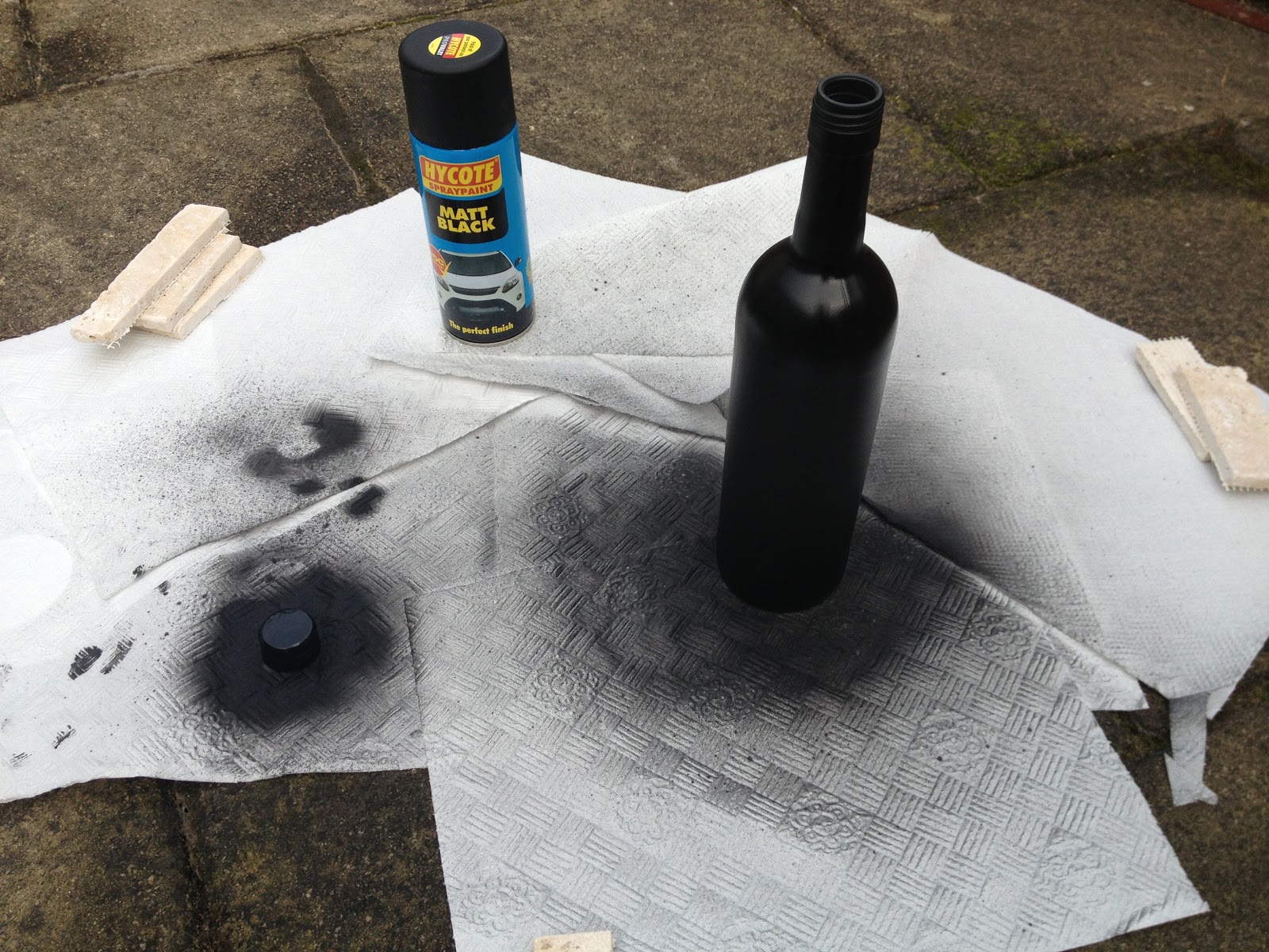
instead of using a photoshop bottle i wanted to actually make my bottle.
So i started by spray-painting a bottle matte black.
I chose matte black because i think its nicer to look at and it looks
cleaner that a glossy bottle.
It also gives it an old vintage look.


So once i'd sprayed a few bottles, i just stuck on paper print outs
of my hole and labels, just to get a feel
of what the bottle might look like finished.


The bottle top will have a hole in it so that you
can what colour the wine is and also it's a play
on the peep hole theme

My finished wine labels, I played around with the type to make
it more fun for the consumer to read. It also looks nice in
contrast to the black and white plain bottle design.

.......................
I also looked into a wine box for the bottle
(even though i didn't actually put this into my brochure)
I don't think a box is necessary for my wine so i just made
a single box.

Here are the finished mock ups that i photographed to
put into my brochure, including a card wine box!

.......................................................
The Brochure
I decided that my brochure was going to be for the public rather than
make one for the wine sellers, so i left out information on prices.
I wanted to carry on the theme of 'peeping' in my brochure.
So i had the idea from the start that pages would have holes
in so you could see the text/image behind, like this cover.

Some of my pages from my final brochure design


- The finished brochure is yet to be printed but coming soon! -
..........

When designing my wine, i always imagined it as a restaurant/bar
So i played around with some images to see what it might look like.
...........................................................................................................................................................................
Here are some images of things that i gathered for my brochure and bottle
And some more that i was inspired by along the way during this project, enjoy!


........