
My journey first began watching the Documentaries and deciding which one i would base my research behind. I chose Senna because it, for me, was the most emotive and informative documentary and the story of Senna i find fascinating.
Once I'd established the documentary i was doing i focused on the identity of the Doc/Fest itself. Research into the Sheffield Doc/Fest showed me that they had an urban image, they used a typewriter font and just 3 colours, black, white and purple. I wanted to keep this urban theme that they had in my work as i feel it is important to not loose that original identity of the Sheffield Doc/Fest. When researching previous posters i found that they were quite basic in design and consisted of typography only, although this interested me, i wanted to create something within my own personal style so i began to think how i could combine art and typography and still keep up with the urban theme.

I began to first create some logos for the Sheffield Doc/Fest. These were my first ideas, i wanted to include colour because i thought of the idea that the Doc/Fest brought people together. However i though that if i created a logo with no colour it would make it easier to place onto posters etc.

This was the logo i then went on to create that i felt was most suitable.
The logo is a simple design of a D, within the D are the initials 'SDF' standing for Sheffield Doc/Fest. the logo is bold and easy to recognise, its also easily adaptable.

i moved on to create more simple logo's and experimented with colours, i liked the principles of this logo and further experimented with it.

i experimented with negative space, i liked the idea but it wasn't practical because it didn't allow you to see the SDF clear enough.

i adapted the logo to each documentary, replacing the black with a still shot from each one.
These adapted logo's i though would look good on adverts or at the beginning of screenings.

i then went on to create some poster ideas that i had with the logo.
Although the poster fits the purpose i felt it was lacking the urban theme that the Sheffield Doc/Fest has and that i wanted to include.


another idea i had for the poster, note i replaced the 'documentaries' D with the logo.
i used an image that was 'without compromise'; a small girl swearing at the camera.
The urban theme i was portraying within the posters coincided with the Doc/Fest's 'no compromise' theme.

another simple poster idea that i had.
I then began to focus on the call for entries poster and i had the idea of someone shouting into a super 8 camera as if it were a megaphone. Having this as a photograph i thought wouldn't be urban or gritty enough to tie in with my theme i wanted to go for. I began thinking of ways i could manipulate images, i had the idea of graffiti. Graffiti has always interested me and visually it appeals to allot of people and it fits in perfectly with the 'No Compromise' and urban themes i was portraying.

this is a collage of images that portray my idea.
i liked the idea and decided to take it further and create it as a piece of graffiti art.
I first took my own images so that the quality would be better this included buying a super 8 camera for only £5 (bargain!).

this was the outcome of the photographs i took, i then had this image simplified into a laser cut stencil. At first i tried to hand cut a stencil but found it time consuming and i lost too much of the detail.


(the hand cut stencil and result)
the results of the laser cut stencil were more what i was hoping for.
i photographed the stencil outcomes and then edited them in Photoshop.


i then went on to stencil the text for my posters and programme titles.


(the Photoshoped outcomes)

Final Doc Fest Call For Entries Poster

Final Doc Fest Poster
How the posters may look superimposed around town centres


Doc/Fest Programme Cover
The Doc/Fest programme is simple in layout which makes it easy to follow the story and read. The text is aligned left and right which encourages the reader to read on.

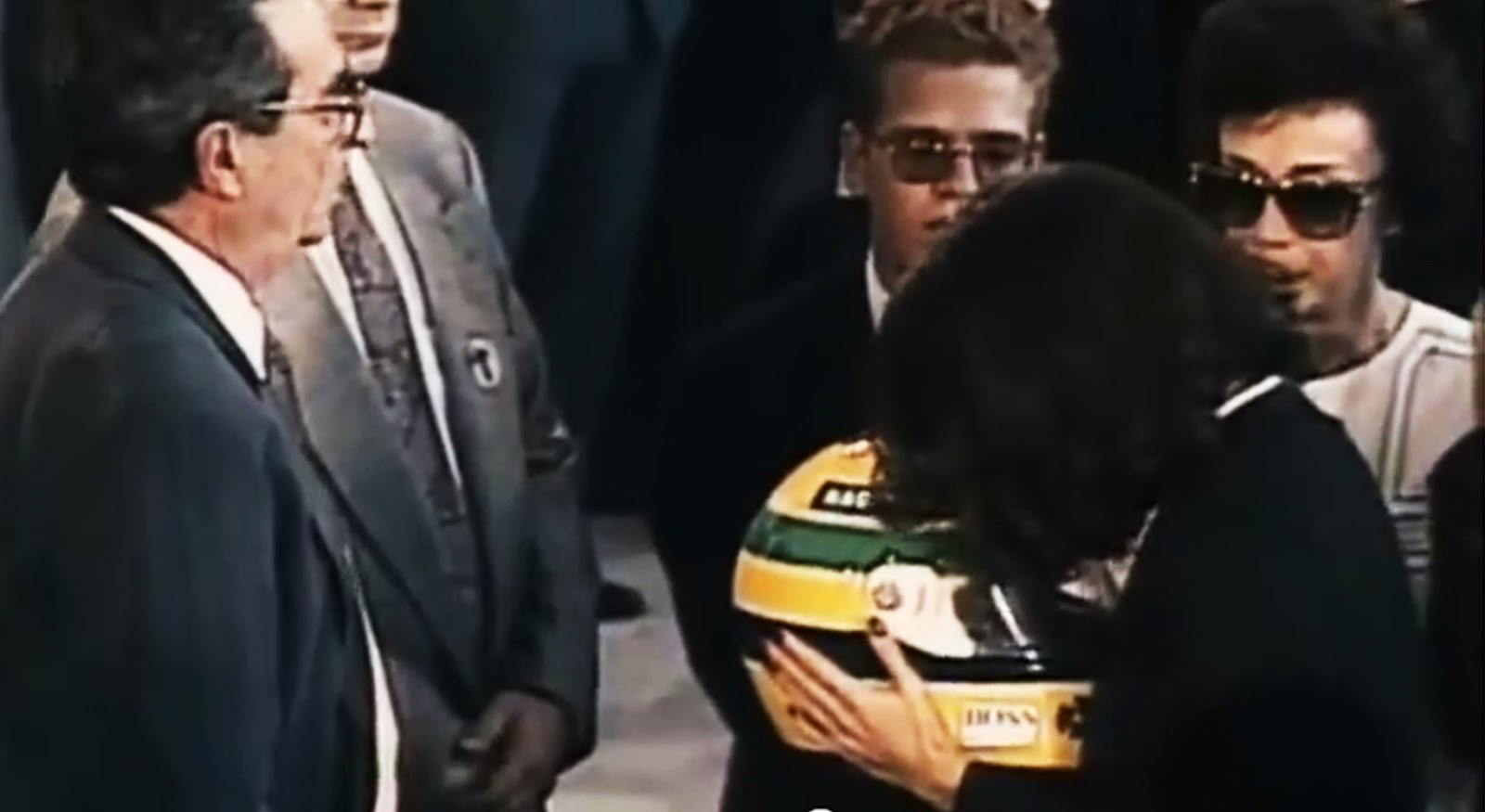
SENNA

Senna Documentary Flyer
For SENNA i wanted to portray a comic book theme, as if Senna was a hero within a comic story of his own. He was a legend and my programme has celebrated this. My cover was created in Photoshop, i used an image of Senna that is well known, i kept it in colour so that it stands out. The final print of would have the colour glossy and matte white background, this would make the colour and the overall cover stand out.
The stories i chose to include are a celebration of Senna's life, as is the documentary.
I featured text from interviews of Senna and those close to him. Images i used i gather online during my research. the 4 stories i chose to use were:
The Man Behind The Helmet, This story tells the reader about Senna and his life and where his racing career started.
The Man Behind The Camera, this story introduces the Director of Senna Asif kapadia.
I felt it was important to inform the reader of the background of the documentary so included an interview with Asif where he discusses Senna and how it was created.
Living On The Edge, this story is about Senna's love for speed and what made him so unique amongst other drivers. i wanted this story to portray his 'untouchable' persona like a comic superhero.
The Rivalry, this story is about Senna and his opponent Alain Prost. i used images from races and comments by both drivers. I wanted to connote a comic book hero and villain type theme with this story, i felt i did this. I also tried to celebrate the relationship between the two drivers.
Legacy, This story celebrates Senna's life contributions to racing and the world, in particular his home country Brazil.
i also included credits to the Senna documentary and a quote by Senna himself.
I felt my Commemorative Programme is a successful tribute to Senna and visually appealing.
The layout of the Programme is simple and easy to read, this will appeal to many people especially if reading in the dark during the documentary screening. The artwork within the programme makes it more of a souvenir which will encourage people to want one and read it.
I encountered a few problems during my work development including my call for entries poster. I struggled with placing all the required text with my image and being happy with the layout. I enjoyed working on the Senna commemorative programme mostly because of the artwork that i created. I wouldn't change anything about my work if i had to do it again and i enjoyed the challenges that the brief presented me with. Overall I'm happy with my outcomes and believe i challenged and fulfilled the brief.

Cover for Senna Commemorative Programme


